Living room color ideas significantly impact the overall mood and atmosphere of your home. Choosing the right palette can transform a space, making it feel larger, cozier, more energetic, or more serene. This guide explores various color palettes, considering room size, lighting, and the psychological effects of color, offering practical advice and inspirational ideas to help you create your dream living room.
We’ll delve into popular color palettes, demonstrating how to use color to enhance different design styles, from modern minimalism to rustic farmhouse charm. We’ll also cover the crucial role of lighting and how it interacts with your chosen colors, providing a step-by-step approach to color selection based on your unique living room’s characteristics. Finally, we’ll show you how to incorporate textures and accent colors to add depth and personality, culminating in a cohesive and stylish design.
Popular Living Room Color Palettes
Choosing the right color palette for your living room can significantly impact the overall mood and atmosphere of your space. The colors you select influence not only the aesthetic appeal but also your emotional well-being and how you experience the room. This section explores several popular palettes and their psychological effects.
Living Room Color Palette Examples
The following table illustrates three distinct color palettes, each designed to evoke a different style and feeling within a living room.
| Palette Name | Primary Color | Accent Color | Descriptive Adjectives |
|---|---|---|---|
| Modern Minimalist | Off-White/Warm Grey | Deep Teal | Clean, sophisticated, serene, calming |
| Rustic Farmhouse | Creamy Beige | Warm Brown/Dusty Rose | Cozy, inviting, warm, natural |
| Vibrant Eclectic | Sunshine Yellow | Turquoise/Coral | Energetic, playful, bold, expressive |
Modern Minimalist Palette Description
This palette centers around a neutral base of off-white or warm grey walls, creating a sense of spaciousness and calm. The deep teal accent color, used in throw pillows, artwork, or a statement rug, adds a touch of sophisticated contrast and visual interest without overwhelming the minimalist aesthetic. The overall mood is one of understated elegance and tranquility.
Rustic Farmhouse Palette Description
A creamy beige forms the foundation of this palette, evoking a sense of warmth and comfort. Warm brown accents, perhaps in wooden furniture or flooring, enhance the rustic feel, while a touch of dusty rose in textiles or decorative items adds a feminine and slightly romantic touch. The atmosphere is inviting and cozy, reminiscent of a charming countryside home.
Vibrant Eclectic Palette Description
This palette is all about bold energy and personality. Sunshine yellow, a cheerful and uplifting color, serves as the primary hue, while turquoise and coral accents provide pops of vibrancy and contrast. The result is a lively and expressive space that reflects an individualistic and playful spirit. This style encourages creative expression through various textures and patterns.
Psychological Effects of Color in the Living Room
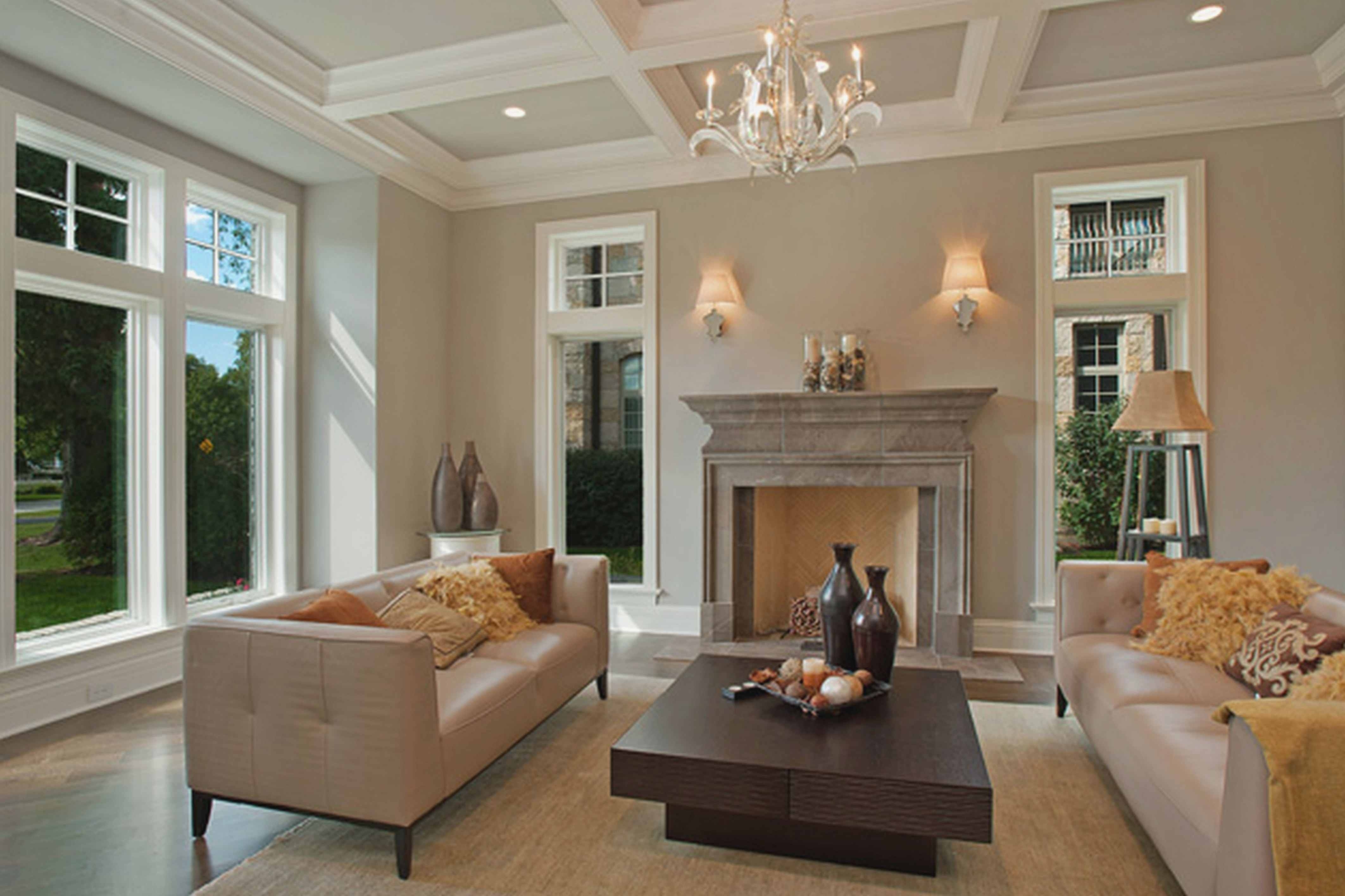
Color psychology plays a crucial role in interior design. Blues and greens, often associated with nature, tend to create a calming and relaxing atmosphere. These colors are ideal for promoting rest and reducing stress. In contrast, yellows and oranges are stimulating and energizing colors, capable of boosting mood and creating a more lively and sociable space. Reds can be used sparingly, as they can be overly stimulating for some individuals. However, a carefully placed red accent can add a touch of drama and sophistication. Neutral colors like greys and beiges provide a versatile backdrop, allowing for greater flexibility in incorporating other colors and styles.
Color Selection Based on Room Size and Lighting
Choosing the right paint color for your living room significantly impacts its perceived size and ambiance. The interplay between color, room dimensions, and lighting conditions is crucial for creating a space that feels both inviting and visually appealing. Understanding how these elements interact allows for informed decisions that optimize the room’s aesthetic and functionality.
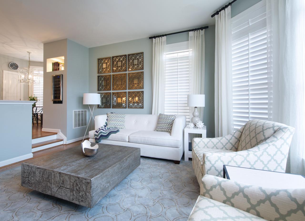
Color significantly affects the perceived size of a room. Lighter colors, such as whites, creams, pastels, and light grays, reflect more light, making a small living room appear larger and more spacious. Darker colors, such as deep blues, greens, or browns, absorb light, creating a cozier, more intimate atmosphere in larger spaces. However, using dark colors in a small room can make it feel cramped and claustrophobic. Conversely, using light colors in a large room might make it feel cold and impersonal.
Impact of Room Size on Color Choice, Living room color ideas
In small living rooms, light and airy colors are preferred. Imagine a small living room painted in a soft, creamy white. The light reflects off the walls, making the room feel brighter and more expansive. The use of mirrors strategically placed can further enhance this effect. Conversely, a large living room painted in a deep navy blue would create a sense of warmth and intimacy. The darker color absorbs light, making the space feel more enclosed and comfortable. The addition of plush furniture and warm lighting fixtures would complement this color choice, contributing to the overall cozy atmosphere.
Impact of Lighting on Color Perception
Natural light dramatically alters color perception. A living room bathed in sunlight will experience colors differently than one primarily lit by artificial light. For example, a pale yellow that appears cheerful and bright in natural light might look dull and washed-out under incandescent lighting. Conversely, a deep red that might feel overwhelming under bright sunlight can appear rich and inviting in the softer glow of a lamp.
Artificial light sources also vary in their color temperature. Cool-toned lighting (like fluorescent lights) can make colors appear cooler and bluer, while warm-toned lighting (like incandescent bulbs or LED lights with a warm white setting) can make colors appear warmer and more yellowish. For instance, a green paint that looks vibrant under warm lighting may appear more muted under cool lighting. Careful consideration of the primary light source – whether natural or artificial – is essential for accurate color selection.
Decision-Making Flowchart for Living Room Color Selection
The following flowchart illustrates a systematic approach to choosing a living room color:
[Imagine a flowchart here. The flowchart would start with a decision point: “Is the living room small or large?” If small, the next decision point would be: “Is the lighting primarily natural or artificial?” This would branch to recommendations for light and airy colors (for small rooms with natural light) or lighter colors with warm undertones (for small rooms with artificial light). If large, the next decision point would be: “What kind of atmosphere is desired (cozy or spacious)?” This would lead to recommendations for dark, rich colors (for a cozy atmosphere) or lighter colors with bold accents (for a spacious feel). The flowchart would ultimately lead to a final decision on a color palette.]
Incorporating Color Accents and Textures
Adding accent colors and textures is crucial for creating a visually appealing and inviting living room. These elements provide depth, personality, and a sense of visual interest, transforming a space from simply functional to truly stylish and comfortable. Strategic use of color and texture can enhance the overall mood and atmosphere of the room, reflecting your personal style and creating a space you’ll love to spend time in.
Accent colors and textures work in harmony with the base color palette to create visual impact. Think of the base color as the foundation, providing a sense of calm and continuity, while accent colors and textures add pops of personality and excitement. A well-balanced approach involves carefully selecting accent colors that complement the base, avoiding clashing hues that could disrupt the overall aesthetic.
Examples of Accent Color Incorporation
Accent colors can be introduced subtly or boldly, depending on your desired effect. Throw pillows in vibrant jewel tones against a neutral sofa instantly add personality. A patterned rug in a complementary color scheme can anchor the seating area and define the space. Artwork, particularly abstract pieces or landscape paintings, can introduce a focal point of color. Other accessories, such as lamps, vases, or decorative bowls, offer further opportunities to weave in accent colors, adding small touches of visual delight.
Texture and Color Palette Suggestions
Different textures evoke different feelings and respond to light in unique ways. Pairing textures with appropriate color palettes can significantly enhance the overall visual appeal and ambiance of the living room.
Choosing the right living room color can dramatically impact the overall feel of the space. Warm, earthy tones can create a cozy atmosphere, while cool blues and greens offer a more calming effect. However, the impact of your color choices is significantly enhanced by proper lighting; selecting the appropriate fixtures and bulbs is crucial, and you can find excellent advice on this at Living room lighting.
Ultimately, the interplay between color and light determines the final mood and ambiance of your living room, so careful consideration of both is essential.
- Velvet: Deep, rich jewel tones like emerald green, sapphire blue, or ruby red complement velvet’s luxurious texture. These colors enhance the fabric’s inherent richness and opulence.
- Linen: Linen’s natural texture pairs well with soft, muted tones like dusty rose, pale blue, or creamy beige. These colors enhance the fabric’s relaxed and airy feel.
- Wool: The warmth of wool is amplified by earthy tones such as terracotta, mustard yellow, or deep forest green. These colors create a cozy and inviting atmosphere.
- Silk: The sheen of silk is best showcased with light, bright colors like blush pink, pale gold, or icy blue. These colors accentuate the fabric’s delicate and sophisticated nature.
- Cotton: Cotton’s versatility allows for a wide range of color palettes. Consider crisp whites, vibrant citrus hues, or classic navy blue for a clean and refreshing look.
Living Room Design with Accent Colors
Imagine a living room with a neutral base color of warm gray. Three accent colors will be strategically used to create visual interest and define different areas within the space.
Choosing the right living room color palette is crucial for setting the mood. Warm neutrals create a cozy atmosphere, while cool tones offer a sense of calm. To really personalize the space and enhance your chosen color scheme, consider the impact of your wall art; a great selection can be found at Living room wall art.
Ultimately, the art you choose will interact with your wall color to create the final ambiance of your living room.
Accent Color 1: Deep Teal (sofa throw pillows and a large area rug): This color adds a sense of sophistication and calmness to the seating area, complementing the warm gray walls and grounding the space.
Accent Color 2: Mustard Yellow (artwork above the fireplace): A vibrant mustard yellow painting above the fireplace acts as a focal point, introducing warmth and energy. The yellow complements the teal, creating a balanced color scheme.
Accent Color 3: Rose Gold (decorative accessories such as lamps and vases): Rose gold accents, strategically placed throughout the room, add a touch of metallic shine and luxury, creating a subtle yet impactful contrast against the gray and warmer tones. This provides a glamorous yet understated touch.
Color Trends and Inspirations
Choosing the right colors for your living room can significantly impact its overall mood and atmosphere. Understanding current trends and how different color schemes interact can help you create a space that reflects your personal style and provides a comfortable and inviting environment. This section will explore current color trends, the visual impact of various color schemes, and provide a detailed mood board example inspired by nature.
Current Living Room Color Trends
Three prominent color trends currently shaping living room design are warm neutrals, saturated jewel tones, and nature-inspired greens and blues. Warm neutrals, such as creamy beiges, soft greiges, and warm whites, offer a sense of calm and sophistication. Saturated jewel tones, including deep emerald greens, sapphire blues, and ruby reds, add a touch of luxury and drama. Nature-inspired greens and blues, ranging from calming sage greens to refreshing ocean blues, evoke a sense of tranquility and connection with the outdoors.
Visual Impact of Analogous vs. Complementary Color Schemes
Analogous color schemes, which utilize colors adjacent to each other on the color wheel (e.g., blues, blue-greens, and greens), create a harmonious and visually soothing effect. They often result in a calm and cohesive atmosphere, perfect for relaxation. In contrast, complementary color schemes, which pair colors opposite each other on the color wheel (e.g., blue and orange, red and green), offer a more vibrant and energetic feel. The high contrast can create a visually stimulating space, but it’s crucial to balance the intensity to avoid overwhelming the room. For example, a deep teal living room (cool) could be accented with warm terracotta (complementary) to add warmth and visual interest without being jarring.
Forest-Inspired Living Room Mood Board
Imagine a living room bathed in the soft, dappled light of a sunlit forest. The walls are painted a muted sage green, reminiscent of moss-covered trees. The flooring is a medium-toned oak, its natural grain adding warmth and texture. Large, plush sofas upholstered in a deep forest green velvet provide comfortable seating. Throws and cushions in varying shades of olive green, forest green, and earthy brown add depth and visual interest. Natural wood accents, such as a coffee table with a live-edge design and woven baskets, further enhance the organic feel. A large window allows ample natural light to filter in, illuminating the space and casting gentle shadows that mimic the forest floor. The overall atmosphere is one of tranquility, serenity, and connection with nature. The air is subtly infused with the scent of pine and earth. The mood is peaceful and inviting, promoting relaxation and a sense of calm.
Color and Furniture Selection
Choosing furniture colors that complement your wall color is crucial for creating a visually appealing and cohesive living room. The interplay between these elements significantly impacts the overall mood and style of the space. Successful color coordination involves understanding both harmonious and contrasting color schemes and how they affect the perception of size and light within the room.
Selecting furniture colors that work well with your wall color involves considering the color wheel and understanding the relationships between hues. Harmonious combinations, often using analogous colors (those located next to each other on the color wheel), create a calm and serene atmosphere. For example, a living room with soft sage green walls would be beautifully complemented by furniture in shades of pale blue-green or muted yellows. In contrast, contrasting combinations, employing colors opposite each other on the color wheel (complementary colors), can inject energy and vibrancy. A living room with deep navy walls could be dramatically accented by furniture in shades of sunshine yellow or burnt orange. The key is balance; a room with too much contrast might feel jarring, while a room with only harmonious colors may feel bland.
Light and Dark Furniture in Light and Dark Rooms
The use of light or dark furniture significantly alters the perception of space in a room. In a living room with light-colored walls, dark furniture creates a grounding effect, adding visual weight and definition. Dark furniture can make a room feel more intimate and sophisticated, particularly in larger spaces. Conversely, light-colored furniture in a light-colored room can make the space feel airy and open, ideal for smaller living rooms where maximizing the sense of spaciousness is important. Imagine a small living room with white walls; light beige or cream-colored furniture will make it feel larger and brighter. Conversely, in a living room with dark walls, light-colored furniture helps to brighten the room and prevent it from feeling too heavy or closed-in. Light furniture in a dark room acts as a visual anchor, drawing the eye and adding contrast. The use of dark furniture in a dark-walled room can create a dramatic and moody atmosphere, but it’s crucial to incorporate sufficient lighting to prevent the room from feeling claustrophobic.
Coordinating Wall, Furniture, and Accessory Colors
Achieving a cohesive and stylish living room involves a holistic approach to color coordination, extending beyond just walls and furniture to encompass accessories like rugs, cushions, and artwork. The overall color scheme should tell a story, reflecting the homeowner’s personality and style. Consider using a dominant color for the walls, a secondary color for the larger furniture pieces (sofa, armchair), and accent colors in smaller items (pillows, throws, artwork). For example, a living room with grey walls might feature a navy blue sofa, beige armchairs, and pops of mustard yellow in the throw pillows and artwork. This creates visual interest without overwhelming the space. Maintaining a consistent color palette across different elements, even with variations in shade and tone, contributes to a sense of harmony and balance. The careful selection and placement of accessories, such as rugs and lamps, can further enhance the overall aesthetic, tying together the different color elements and creating a unified and sophisticated look.
Last Recap: Living Room Color Ideas
Ultimately, selecting the perfect living room color scheme is a journey of personal expression and careful consideration. By understanding the psychology of color, the impact of lighting, and the art of incorporating textures and accents, you can create a living space that reflects your style and enhances your well-being. Remember to experiment, have fun, and let your creativity guide you as you transform your living room into a haven of comfort and style.